A brand is a complex organism. This is part nine in a series of articles in which we examine a successful brand’s component parts.
In the 1990s, Italian clothing merchant Benetton attracted a lot of attention for its worldwide ad campaign that featured provocative photos—none of which had anything to do with their products. Graphic images that included mating horses, a nun and priest kissing, and a white baby being nursed by a black woman were chosen for their irreverence rather than their relevance. Over time, this affinity for the outrageous came to define the Benetton brand.
To a great extent, we come to understand the world through our eyes. Imagery can shape the way we experience a business — images can set a tone, drive expectations, or set a firm apart from the field.

Brand Images at Work
I can think of no company that has used imagery — or a style of imagery — to better effect than Apple. Simple product shots silhouetted against a white background convey a powerful sophistication. And the way these photos focus on Apple’s products without any extraneous dressing has become an iconic part of their brand. One glance at an Apple billboard, web page or advertisement is enough to connect the product with the company. That’s pretty amazing.

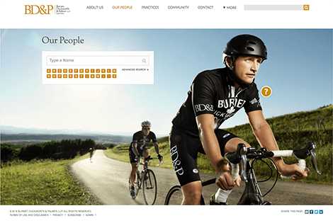
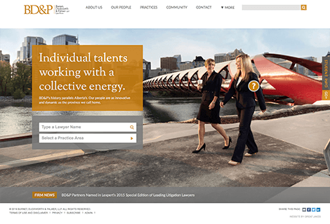
Images, however, don’t always have to be the stars of a brand. They can play a supporting role. Calgary-based Burnett, Duckworth & Palmer recently unveiled new branding that features photography of actual employees. While not a groundbreaking approach, their imagery supports the proposition that their people are the drivers of their success. The images help elevate BD&P above a sea of law firms that forego the expense and risk (employees leave firms, after all) of custom photography.
SEE ALSO: Why Professional Photography Matters On Your Website
Picking an Approach
When selecting imagery for your firm, consider what role you want it to play. Will it set a striking visual tone? Will it differentiate you? Will it reveal your firm’s personality? Will it support your messaging?
And when it comes to the type of imagery you choose, you have a number of options to consider: photos vs. illustration, representational vs. abstract, conceptual vs. literal, stock vs. custom. In general, the more you are willing to spend on imagery, the more unique your brand will feel. If, however, you opt for low-cost stock imagery, at least try to take a different approach than your competitors. A brand that says nothing new is a wasted investment.
Read Earlier Posts in This Series:
- Elements of a Successful Brand 1: Brand Positioning
- Elements of a Successful Brand 2: The Tagline
- Elements of a Successful Brand 3: Personality
- Elements of a Successful Brand 4: Brand Promise
- Elements of a Successful Brand 5: The Name
- Elements of a Successful Brand 6: The Logo
- Elements of a Successful Brand 7: Color
- Elements of a Successful Brand 8: Messaging
- Elements of a Successful Brand 9: Imagery
Additional Resources
- Our Rebranding Kit gives you the tools and knowledge you need to lead your firm through a rebranding.
- Get strategies, tips, and tools for developing your firm’s brand with Hinge’s Brand Building Guide for Professional Services Firms.
- Download a free copy of the book Inside the Buyer’s Brain to learn how to build a powerful brand to help your firm close more sales.
How Hinge Can Help
Develop rebranding strategies that better connect with existing clients and prospects. Hinge’s Branding Program can help your firm stand out from the competition and build a brand that drives sustained growth.