Brand identity is a frequently misunderstood concept. Much of this confusion comes from the loose and inconsistent use of brand terminology in the popular press—and even in the marketing industry itself. But “brand identity” not only has a very specific meaning, it is a powerful tool you can use to influence the way people think about your firm. The sooner you understand brand identity and what it can (and can’t) do, the sooner you can start improving your identity and changing how people perceive your firm.
Let’s start with a definition.
What is Brand Identity?
Your brand identity is the visual—and to a lesser extent, verbal—expression of your brand. It comprises eight components:
- Company name
- Logo
- Tagline
- Color Palette
- Typography
- Graphical Elements
- Imagery
- Voice
When used to support a brand strategy, your brand identity provides important visual cues that convey positive qualities and help allay concerns people may have about your brand. These qualities can be difficult to put into words, but they can be psychologically persuasive. For instance, a clean and modern identity can communicate a firm’s attention to detail and credibility.
When your audience combines these cues with other information—say, the messaging on your firm’s website or a presentation given by one of your principals—they begin to develop positive feelings about your brand. They start to trust you and associate your firm with particular things, such as specific expertise, a service offering or successful outcomes.
Each of a brand identity’s components should contribute incrementally to these associations and positive feelings. When thoughtfully designed, these elements build upon each other and communicate a coherent visual message. (We’ll explore each of these components a bit later in this article.)
Another critical role brand identity plays in a brand strategy is differentiation. Professional services firms have a hard enough time separating themselves from similar competitors—a distinctive identity can compel prospective buyers to notice you and perhaps take a second look.
How is Brand Identity Different from a Brand?
If brand identity is the visual part of your brand, your brand is the way people perceive and experience your firm. Think of your brand identity as an input and your brand as the output. Brand identity is not the only input, however. It works in concert with your differentiators, brand positioning, brand personality and brand messaging to influence the way the brand is perceived in the marketplace. Other influences on your brand include your customer service, online reviews, positive or negative press and how well the experience you produce matches the one you promise (your brand promise).
Jeff Bezos may have been the first to describe a brand like this: “A brand is what other people say about you when you aren’t in the room.” This is a useful way to think about your brand—and what it will take to shape what those people say about your firm. Brand identity is one of the best tools you have to sculpt those perceptions.
Elements of Brand Identity
Now, let’s examine the components of brand identity. Each plays a different role, but they deliver their greatest impact when deployed together. When they are conceived as part of a system that supports a firm’s brand positioning, the resulting brand identity speaks more loudly and with greater authority.
Of course, many firms develop their visual brand with little regard to strategy. They either cobble together a dog’s breakfast of mismatched components over time, or they copy the firms around them, choosing the false comfort of blending into the crowd.
But you can do better. Each component of your identity is an opportunity to influence the way people perceive your firm. And if you understand how these elements can deliver a unified experience, you can build an extraordinary, persuasive brand identity.
1. Name
Nothing is more essential to a brand than its name. Without a name, you can’t do marketing, and without marketing you can’t do business. Your name is your chief identifier and proxy for your firm. When someone thinks of your business, they express it first as your name. So it pays to choose your name carefully.
Naming has become a complicated process in which you navigate an archipelago of hazards—including trademark conflicts, originality, pronunciation, spelling, URL availability, and semantics—to arrive at a moniker that perfectly represents your firm. It’s a bewildering but rewarding journey.
Strong names tend to be short, memorable and easy to say and spell. They look and sound different from your competitors. Usually they are abstract or evocative, rather than literal descriptions of what you do.
Weak names are often long, prone to abbreviation, confusing or generic. In the professional services, for instance, firms are fond of stringing together partners’ names. What stokes their egos, however, chokes their brand. Clients, who have little patience for complexity, inevitably drop all but the initial name or, worse, collapse the whole kit and kaboodle into a sterile, impossible-to-protect acronym.
If you are considering renaming your business, hire a professional or agency with the experience, tools and good taste to steer you toward a powerful, differentiated name. It will put a sharper tip on your marketing strategy and stick more readily in the minds of prospects.
2. Logo
Your logo is one of the most visible and instantly recognizable components of your brand. And because it incorporates your name, your logo can, on occasion, stand on its own (for example, on the side of your building or on a sponsor board).
A logo has three jobs: 1) identify you; 2) differentiate you; and 3) help people remember you. That means it has to represent your firm visually, set you apart from competitors’ logos and do all this in a way that is interesting and easy to recall.
Most logos consist of two parts: a logotype (the name) and a symbol (the mark). Some logos don’t have a symbol at all. And at least a couple of brands have had success using a symbol alone (hint: think swoosh and partly eaten fruit). But unless you have millions to dump into advertising, don’t try that last one at home.
Many firms are reluctant to change their logos, even when they know they aren’t great. They believe that replacing it now would erase all the brand equity they’ve built over the years. But what they fail to realize is that their brand identity is much weaker without an inspiring admiral at its helm. An otherwise wonderful identity with a lousy logo is dragging an anchor: it will never get up to speed.
These firms also don’t understand what a wonderful opportunity a rebrand provides. It is one of the few times you can do something and people will actually take notice! This window of caring is brief, but it’s real. If you promote your new brand properly, prospects will look at you with fresh eyes—and perhaps with renewed interest.
3. Tagline
Not every firm has a tagline, and to be honest not every firm needs one. In fact, many firms use taglines that provide no value at all. But in many circumstances, a tagline can be a helpful tool, especially if serves one of these four functions:
- Clarifying what you do
- Expressing an important brand attribute
- Articulating your positioning
- Helping people remember you
Rarely, however, does a tagline achieve more than one of these functions.
Most often, a clarifying tagline is what we call a descriptor—a straightforward description of the services you provide. Accounting firms are particularly fond of descriptors (“CPAs & Advisors” and its variants is a common one). Descriptors can be particularly useful when a firm is trying to break into a new market where they aren’t yet known.
Some firms want to call out a salient attribute of their brand, and a tagline can be an excellent place to do that. Here are two examples that take this approach:
- Prodigy: Bold ideas. Brought to Life.
- Accenture: Let There Be Change
If you have a narrow or easy-to-express positioning, a tagline can be a terrific place to spell it out. For instance, one law firm that has a strong land use and zoning focus calls themselves “The land lawyers.” It doesn’t get clearer than that.
Finally, there is the category of taglines that are written to be memorable or help differentiate the brand. These may feature a clever play on words, a provocative question or a catchy phrase. Nike’s “Just do it” springs to mind. Capital One asks, “What’s in your wallet?” IBM delivers “Solutions for a small planet.” And accounting firm Cherry Bekaert runs with “Your guide forward.” What do these all have in common? They are simple and stick in the mind like bubblegum.
4. Color Palette
Of all the components in your brand identity, color is the most emotionally engaging. But be careful. While there has been plenty of research into how people react to different colors, you are probably better off looking to strategy rather than psychology when you choose which colors to associate with your brand. And please, don’t choose colors based on your CEO’s personal preference!
Why? Because color is critical tool you can use to differentiate your firm and set a mood for your brand. It’s an opportunity to take your identity in a fresh direction. How do you think UPS came to “own” the color brown? Brown, after all, is not exactly everybody’s first, second or even third favorite color. In fact, the company chose the color way back in 1916 to reflect “class, elegance and professionalism,” like a fine Pullman car. Today, the company has completely embraced the color, turning it into their most iconic identifier and making it the focus of their marketing slogan: “What can brown do for you?” In 1998, they trademarked their signature hue of brown to prevent competitors from adopting it. In short, strategy—not emotion—drove their color decision.
Try this: look at the logos and websites of the firms you compete against most often, then see if you can spot any trends and opportunities: what colors are used most often? Is there a color could you own that none of these competitors has taken? Or is there another color strategy—such as a multi-hued approach—you could employ to differentiate your logo and brand identity?
Though one color often plays a dominant role, most brands don’t rely on a single color alone for their identity. Instead, they develop a palette of colors, which gives them the variety they need to create compelling marketing materials. While some brands work with a very limited color palette (as few as two or three), most prefer the flexibility that comes with a wider color selection.
5. Typography
Unlike color, the typefaces you choose for your brand may be barely noticed. But making tasteful, subtle choices is the key to sophistication. At the world’s leading firms, selecting the right typeface (also commonly but not quite correctly called a font) is a big decision.
Beyond choosing between serif and sans serif typefaces, you’ll have to wrestle with a host of decisions:
- What personality do you want to convey?
- Are you trying to be buttoned up or approachable?
- Is it more important to be distinctive or readable?
- Do you want to look modern or traditional?
- Do you need more than one typeface?
On that last point, consider that you may want a unique, and perhaps highly customized, typeface for your logo, but you may need a more practical face to use in your marketing materials. You may even choose multiple typefaces—for instance, a sans serif for headlines and a serif for body copy.
Then there is the issue of electronic formats. If you don’t want to pay annual licensing fees to use your firm’s typeface on your website, you can choose to substitute a similar face from a free online resource (for instance, Google offers a large, high-quality, free library of type options).
But it doesn’t end there. You may need to choose yet another substitute typeface for electronic documents that you will distribute to clients and the outside world. While Microsoft provides a way to embed certain fonts in their documents, this technique has enough limitations that we don’t recommend it. Instead, you should assume that your typeface won’t be portable and choose a substitute font from those that are commonly distributed with Microsoft Office (you can find a list here).
Despite the significant compromises imposed by digital typography, type still has a lot to contribute to your brand’s storyline.
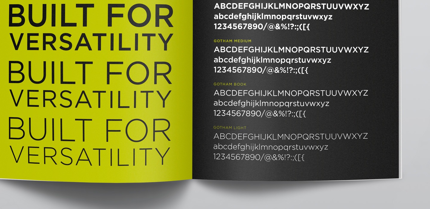
Figure 1. Typography is often featured in a firm’s brand style guidelines.
6. Graphical Elements
Some brands use a major graphical device to deliver a distinctive, easy-to-recognize look across a wide range of materials and media. The best way to understand what I’m talking about is to look at a couple of examples.
Here is Big 4 firm, PricewaterhouseCoopers’ identity. Notice how the mark in their logo becomes the defining graphical element of their brand. It is flexible enough that it can be used in a wide variety of contexts.
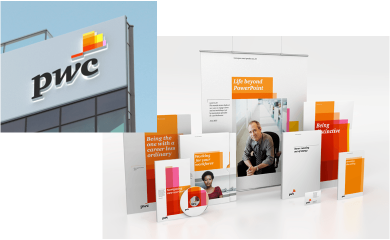
Figure 2. PricewaterhouseCoopers’ brand identity makes frequent use of a colorful and flexible brand element.
In the following example from a much smaller accounting firm, a speech bubble—representing the firm’s friendly, personal approach to business—is the central theme of their identity. (Also, note how the tagline works with the speech bubble.)
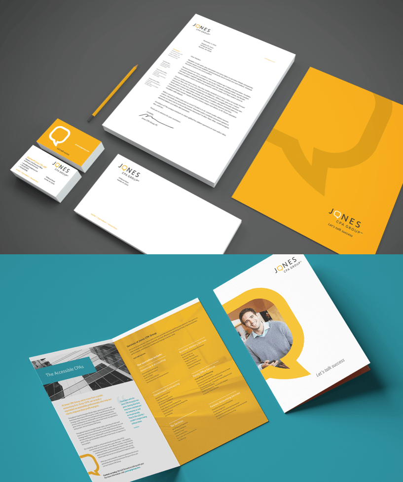
Figure 3. Jones CPA Group’s speech bubble makes a frequent appearance in its identity.
Developing a universal graphical device is optional, but it is something to consider if you are about to rebrand your firm. It can be an effective and differentiating way to apply your identity to a range of materials.
7. Imagery
Over thirty years ago, Italian fashion brand Benetton began blurring the line between social activism and marketing when it decided to feature graphic, editorial-style photos in its advertisements. The effect was shocking and controversial, but it sure made people sit up and take notice. The campaign has indelibly tied the brand to social consciousness.

Figure 4. Over the years, Benetton has made controversy a major theme of their image strategy.
Most professional services firms, of course, can’t afford to be socially or politically provocative. But they can choose to be interesting. The images you use in your brand identity can turn heads, turn people off or—tragically—make no impression at all.
Sadly, most firms fall into this last category, and often they do it on purpose. Unwilling to take risks, they choose the deceptive “safety” of the familiar. They enter the crowded down-elevator of organizations that embrace clichéed imagery and descend into the sub basements of sameness.
Remember: “identity” does not mean “identical.” So why would you select imagery that looks like someone else’s? In fact, imagery, whether photographic or illustrated, is an ideal opportunity to differentiate your firm.
One reason clichés are so prevalent is that many firm leaders are uncomfortable with abstraction. If they can’t represent what they do literally, they are usually willing (if reluctantly) to accept familiar metaphors that can be easily connected to what they do or the positive outcomes they produce. Here are a few examples taken from actual professional services websites:

Figure 5. Clichéed images like these can sink a promising brand identity.
So what are you to do?
For starters, if you are going the stock photography route, use a better source of images, one with fresher images in its catalog (a decent free resource is Unsplash, but be aware there are plenty of clunkers in there, too). Searching for images in an online stock photo library is an art. Usually, when you search on the obvious terms you get the least creative and most commonly used results. The trick is to think conceptually. And when I say conceptually, I don’t mean searching on broad, benefit-oriented business terms like “success” or “growth.” Those just aren’t going to generate productive ideas. Instead you need to get creative and find a new angle.
Alternatively, you can try one of these strategies:
- Search for stock illustrations rather than photography. Look for a fresh-looking, contemporary style.
- Try searching for black and white images. Often, these can be more evocative and dramatic than their color counterparts.
- Use abstract or creatively cropped images.
- Shoot custom photography. A talented photographer can do wonders.
- Hire an illustrator to develop a series of custom illustrations.
- Apply an effect, pattern or texture to your images. This can make ordinary images feel more customized.
- Combining images in Photoshop to create interesting composites.
- Avoid imagery altogether and take a type-centric approach to your identity.

Figure 6. Boston Consulting Group (BCG) uses tightly cropped architectural shots in these four website sliders to convey business success in a fresh way.

Figure 7. Frame creates an appealing but differentiated brand identity using simple isometric illustrations.
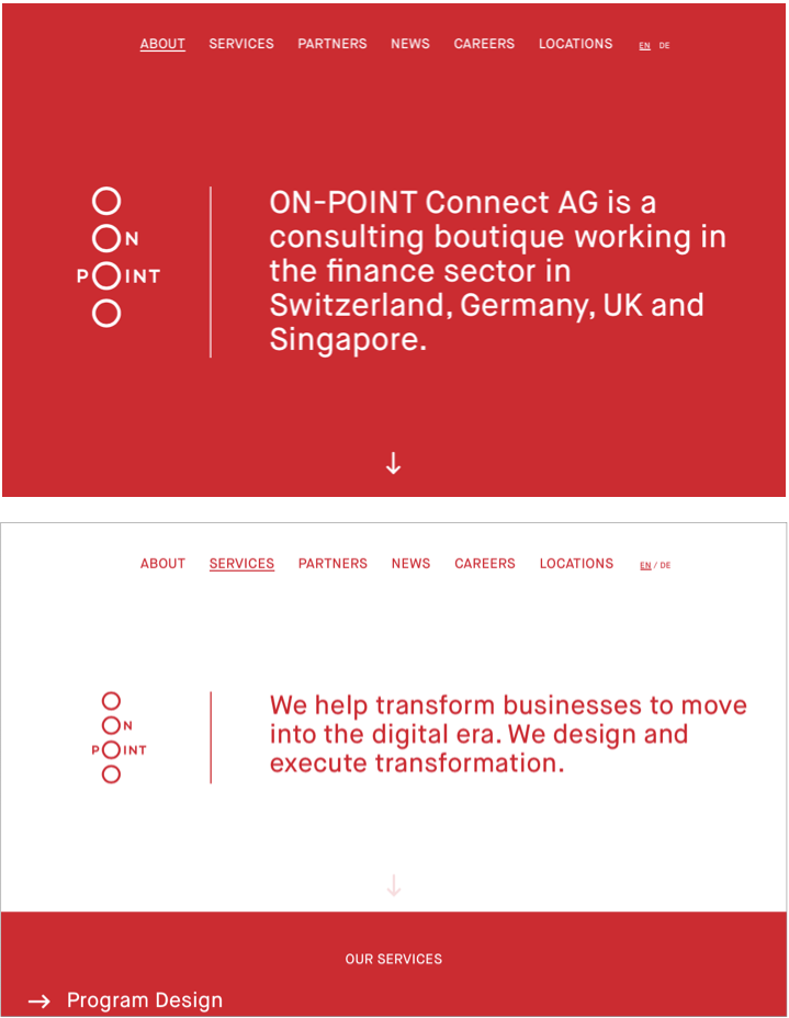
Figure 8. ON-POINT Connect cultivates a distinctive, minimalist look with nothing more than colors, shapes and type.
8. Voice
Your brand identity isn’t all visual. It has an important verbal component, too, called your voice. Your voice is the way you write (and in some cases, talk) about your firm. Like all the components of your brand identity, you voice is most compelling when it fits your brand strategy. If you pair bold, playful visuals with passive language, for instance, you’ll create an unhappy dissonance. The voice needs to match the rest of your identity.
To define your voice, think about the personality you want to convey:
- Light and friendly? Technical and academic? Or professional and businesslike?
- What writing style will you adopt? Short, direct sentences with minimal jargon? Or something more formal?
- Are you fun or serious?
- Are you open to humor or clever, playful headlines?
Many firms then take the next step and describe their voice in a Tone of Voice document (sometimes called a Tone and Voice document). That way, internal staff and external partners can consult it when they write and speak to outside audiences. A Tone of Voice document can be a single page with general guidelines or it can be more comprehensive, containing sample article excerpts, emails and phone scripts. At the extreme end, they can even include detailed language style guidelines that clarify potential points of inconsistency such as punctuation, abbreviations, capitalization, word choice and syntax.
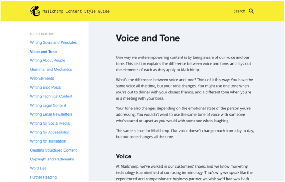
Figure 9. MailChimp addresses voice and tone in their online content style guide.
Brand Style Guidelines & Enforcement
At some point in the process you should begin documenting your brand identity and produce a set of guidelines that will preserve your brand investment over time. Your branding partner is often in the best position to put this document together.
Here are some common topics you might cover in brand style guidelines:
- Logo usage (clear space, sizing, logo version descriptions, usage restrictions, etc.)
- Tagline usage
- Color palette
- Typography
- Imagery
- Graphical elements
- Layout guidance (with or without examples)
- Environmental signage
- Vehicle graphics & apparel
- Tone and voice
Brand guidelines come in many forms, from the basics of logo usage and colors to highly prescriptive, multi-volume manuals covering every possible implementation contingency. Most brand guidelines fall somewhere in between.
In our experience, the more detailed and inflexible the guidelines, the more likely people are to ignore them. On the other hand, if nobody enforces them, even the simplest brand guidelines will fall by the wayside. To prevent your identity going feral, designate a person, typically in the marketing department, to manage freelance designers and keep an eye on how various groups in your organization are implementing the brand. You will need to vest this person with an appropriate level of authority to correct situations in which people violate the rules. But enforcement will only go so far. It’s just as important to educate the relevant people in your organization about the new brand and how to implement it correctly.
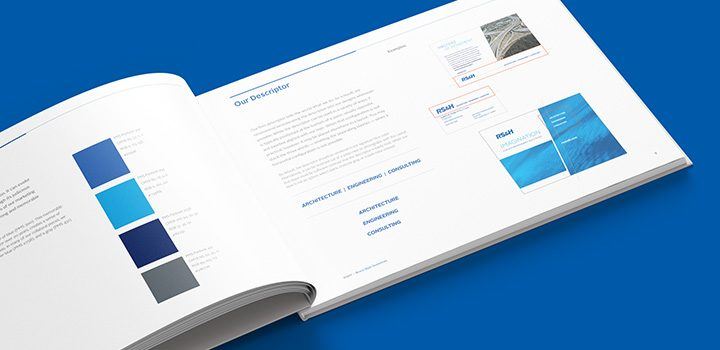
Figure 10. Brand style guidelines for Florida-based engineering firm RS&H.
Examples of Brand Identity in the Professional Services
In the professional services, brand identity design has to strike the right balance between credibility and differentiation. In many professional industries, such as law and accounting, clients are looking for a firm that they can trust with sensitive information, and the way these firms present themselves visually can contribute to that impression. The trick is to avoid falling into the trap of building an undifferentiated brand image. Other professional services industries, however, can afford to take a more daring approach. Below are three examples of firms that have developed brand identities that get the balance just right for their audiences.
S&ME
This engineering firm created a bold, differentiated brand identity to separate themselves visually and psychologically from their more conservative peers.
Figure 11. A brief animated video helped explain and launch their new brand.

Figure 12. An innovative logo anchors S&ME’s unusual identity.

Figure 13. Their brand identity brings energy and color to their website.

Figure 14. The identity has many applications across their business.
Darnall Sykes Wealth Partners
This wealth management practice takes a conservative yet distinctive approach its identity, mounting its jewel-toned identity in a setting of rich purple.

Figure 15. Darnall Sykes’ stationery suite projects high credibility and stands apart from similar competitors.

Figure 16. Their website uses color, words and images to communicate their brand with confidence.
Quinn Evans — An Architecture Firm
This architecture firm has a strong national reputation for historic restoration, which is reflected in its logo, color palette and type. At the same time, the identity also points to the future and the innovative contemporary designs Quinn Evans produces.
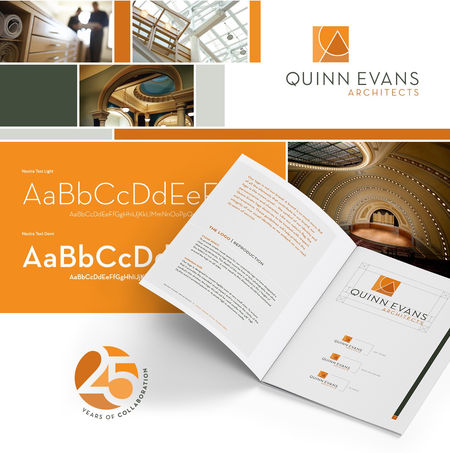
Figure 17. Custom photography, typography, color and history coalesce in an iconic brand identity.
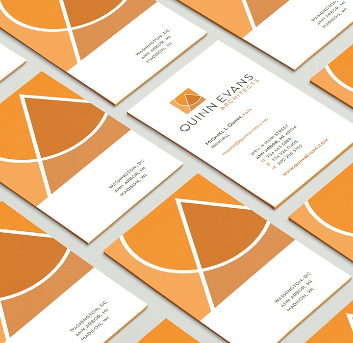
Figure 18. The logo features prominently on the firm’s business cards.
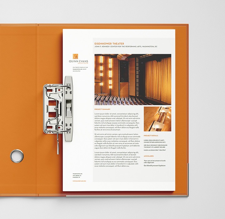
Figure 19. The identity, here applied to a piece of collateral, communicates the firm’s attention to detail and credibility through design.
Conclusion
Humans are visual creatures. We process visual information more quickly and viscerally than we do words. That’s why top firms pay a great deal of attention to the way their brands look and the emotional connections they create.
Brand identity is a powerful tool that a firm can use to differentiate its brand and embue it with positive images, feelings and ideas. When you develop a thoughtful identity system—one founded on a deliberate strategy—you can make a great impression at every touchpoint in the business development and client delivery processes.

How Hinge Can Help
The best brand building strategies help your firm connect with its buyers, build your reputation, and increase your marketplace visibility. Hinge’s Branding Program can help your firm stand out from the competition and build a brand that drives sustained growth.
Additional Resources
- Our Rebranding Guide gives you the tools and knowledge you need to lead your firm through a rebranding.
- And our Differentiation Guide for Professional Services Firms will help you position your firm’s brand based on real differentiators.