When professional services marketers set out to create an effective call to action, or CTA, they often design according to a vague sense of what looks good, feels right, or lines up with some perceived best practice.
We have long argued that professional services marketing is more science than art. And the most successful calls to action encouraging user action because they are shaped by leading behavioral science. We can scientifically analyze CTAs, track their success, and refine them to be as effective as possible.
To understand what makes the best, most persuasive online offers, let’s dive into the psychology of effective CTAs.
What makes a call-to-action effective?
It’s useful for us to first define our terms. What exactly do we mean by a call to action?
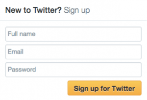
At its most basic, a call-to-action is a combination of copy and design elements intended to encourage an action on the part of your audience. You’ve seen CTAs all across the web, often in the form of buttons. Take a look at Twitter’s “Sign up for Twitter” CTA:

An effective CTA helps the user answer the question, “What do I do next?” So it should come as no surprise that the science of human behavior determines successful call-to-action design. Behind the art of the CTA is the science of decision making.
The science of decision making
While we may think of ourselves as uniformly rational creatures, the fact is human beings often make decisions rooted in our “lizard brain.” Our responses are based in the amygdala, a region of the brain largely responsible for fear, emotions and impulsive actions. A rational decision can sometimes be overridden or quietly informed by emotional exertions of the amygdala.
What does this mean in practice? For starters, it means our choices are often shaped by factors external or arbitrary to the matter at hand. Research by Dan Ariely, Duke University professor and author of Predictably Irrational, explaiins this phenomenon and the implications for buying decisions.
 A few years ago, Ariely encountered three side-by-side subscription offers on the website for The Economist magazine. Buyers could:
- Subscribe to the web edition for $59.00
- Subscribe to the print edition for $125.00
- Subscribe to both the web and print edition for $125.00
He decided to run an experiment, asking a sample of 100 students to select a plan. Unsurprisingly, no one chose the print-only plan. Instead, 16% of the respondents chose the web-only subscription, and 84% selected the combined web and print subscription.
Next, Ariely removed the seemingly nonsensical print-only offer from the lineup. This time, the distribution of choices flipped:
- 68% of respondents chose the web-only subscription
- 32% selected the web and print subscription
What happened? The print-only deal (which no one actually wanted) provided a reference point for the decision, the web and print combination seemed like an exceptional deal. Without the print-only option, the perception of the respective offerings shifted.
The presence of the print-only deal didn’t actually change the price point or value proposition of the other two subscriptions. But it radically altered the way buyers made decisions. What does this prove? Context matters. This same principle is at work in online calls to action.
Context and emotion in CTAs
Let’s put the pieces together. When someone encounters a CTA online, their reactions are going to be informed by their “lizard brain.” Depending on the action you’re trying to prompt, they might be anxious about a prospective purchasing decision or curious to learn more about a content offer.
As you design your CTAs, it’s important to manage their context—and aesthetic details that might initially seem incidental—to encourage the desired response. By controlling the context, you can achieve your marketing goals with greater success, especially as you experiment with the contextual details and refine your CTAs.
SEE ALSO: Top 10 Marketing Techniques for Professional Services Firms
Fine Tuning your CTA
What do those details look like? How precisely can you craft and fine-tune your CTAs? For the best results, you’ll need to take a scientific approach.
Because context is so important, there is no universal ideal when it comes to CTAs. But certain general principles hold true across a wide range of circumstances. Important characteristics to consider include color and size, the copy, and the surroundings.
Color and size
Your call-to-action button should stand out from the rest of the page, while making it clear that it is a clickable button. You can accomplish this through design elements like color and size.
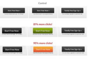
Bright, active colors are consistently more effective than grays, which tend to appear inactive. The particular click rate on a given CTA can vary dramatically according to its color, so testing can be very useful.
Here’s such an example:

As a rule, bigger is better for CTAs. The mind interprets the significance of page elements according to their relative prominence, so large buttons lend a CTA an immediate sense of importance and give the page a forward drive. Consider this example from Spotify:

This CTA employs both bright, appealing, and active colors as well as a large, clear design for the buttons. It is clear to users what the next step is (in this case, to download Spotify).
Note that there are actually two calls-to-action buttons directing users to the same end, one in the page’s “mainstage” and one in the navigation bar. Multiple CTAs with different goals could confuse users. This unified design makes it clear what they should do next.
Copy
In call-to-action copy, active language is more engaging than a passive description. Similarly, the text should feel both personal and specific. There are a handful of best practices you can follow to make your CTAs as effective as possible:
- Lead with a verb. Describe exactly what clicking the button will do.
- Be specific. The CTA above doesn’t say “Download app” or simply “Download.” It tells users exactly what they will get.
- Try writing the copy in the first person. The language should speak directly to a desire on the part of the user, and it should feel personal. Try filling in the blank in the sentence, “I want to __________.” Sometimes you may write the copy explicitly in the first person. “Start my free trial,” for example, tests better than “Start your free trial.”
Surroundings
Remember Dan Ariely’s comparison of three different subscription offers for The Economist? It applies directly to online offers and calls to action. When an offer is positioned as the mid-point between two other offerings, it tends to convert at the highest rate—and at a higher rate than if the offer were presented on its own.
The middle offer below benefits from the presence of less appealing options, which may be pricier on one end and insufficient on the other.

Given this context, strategic highlighting may nudge users toward the desired path. Once audiences have demonstrated a preference for this option, you may even reinforce the pattern by labeling this choice the “most popular.”
Testing is Critical to Increasing Effectiveness
When it comes to CTAs, design and copywriting best practices will only take you so far. What really works is testing. A/B testing—comparing the statistical performance of two variants with only one difference—is the only true way to learn what works best.
In an A/B test you can compare the performance of a single variable. You randomly serve up two different versions of a web page or email to visitors over a period of time—long enough to achieve statistical significance. Only a single variation should differ between the two versions. That way you know exactly what affected the change in behavior. At the end of the test period, compare the performance of the two options. If there is a clear winner, use that CTA moving forward.
____
For optimal results, professional services marketers must take a scientific approach to increasing the effectiveness of Calls To Action and maintain that approach diligently. As marketing evolves, the leaders in the field will increasingly set themselves apart by their mastery of the science behind their art.
Additional Resources
- Download a free copy of the Lead Generating Website Guide.
- Learn about the most effective online marketing strategies to generate leads in our Online Marketing for Professional Services
How Hinge Can Help
Need help with lead generation? It’s one of our specialties. Contact us to learn how we can help put your website to work and turn it into a lead generating machine.


