A great first impression can convert a lead into a sale in a matter of moments. A bad impression… Well you know the story there. Your landing page is your first impression. The best converting landing pages are all built on similar foundations.
Driving traffic to your website is, of course, a priority, and building a landing page is a staple of online professional services marketing. But if the landing page fails to convert visitors to clients in the conversion funnel the traffic means nothing, especially in the B2B world.
Download the Marketing Planning Guide: Third Edition
Landing pages are not cookie cutter. Some elements work better for some audiences. Let’s explore the specifics of a successful high converting landing page and why they work.
Landing Page Basics
 Landing pages are created with one intention: to entice visitors to act. That action may be to sign up for a seminar, join a waitlist on an upcoming product, subscribe to a blog, or buy a service. It can be anything, but it is all centered around moving that initial visitor into your conversion or sales funnel. Every element on the landing page should come with a clear and easy way for your audience to learn more, sign up, or engage in whatever action you choose.
Text or Video
A landing page that has mostly text with a couple of images is a popular choice. These landing pages are to the point and direct. Because it is mostly text, the page is fast loading which is great for Google.
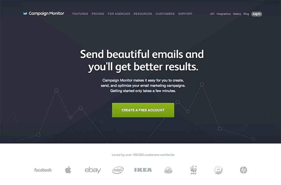
Source: Campaign Monitor
Having a landing page with a short video that explains your product or service to your visitor is another popular choice. A video will increase the time on site and also gives authenticity and trust to your website. A video is always a good choice when there are complex details about your product or service.
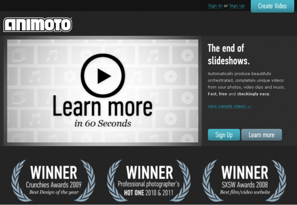
Source: Amimoto
Now You’re Talking My Language
Like design, good copy is an art. It should be short, but not so short to lose critical detail. It must engage quickly, but inspire lasting trust. The best converting landing pages must use the vocabulary of a target audience, but not fall victim to jargon or industry-speak.
Good copy even finds the line between educating and entertaining, strategically inserting keywords within both headlines and copy. Here are a few elements to consider when constructing your content.
- Headline. Your headline is the first thing your visitor sees on your landing page. Keep it consistent and make sure to insert your keyword here. An H1 tag for the headline is the perfect place to put your keyword.
- Copy. Long or short, your copy needs to stay consistent with the keyword and intent of the page. Keep the keyword placement focused with small groups of phrases that describe what you can offer the visitor. This is also where you want to place any call to action.
- Call to action. A landing page needs to convert. The best way to convert visitors is through a call to action (CTA). The CTA wording should convey a quick action emotion. Use commonly understood words that convey value and trust. Some common ones include “send me info” “download your guide” or “start your free trial”. Feel free to venture out and test some CTA’s posed as a question to entice visitors such as “what’s in it for me?” “do you want to know more?”
Source: QuickSprout
SEE ALSO: Does Your Professional Services Firm Need a High Performance or a Branding Website?
Tools of Engagement
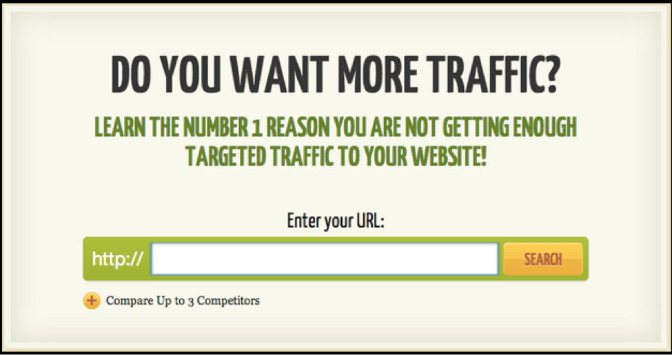
A landing page is the perfect place to show off your special tool, calculator, or other interactive element. Anytime your page actively engages your audience, your conversions will rise. These interactive elements can be simple, like a click-to-play video, or advanced, like an automatic website grader (which requires the visitor to paste their URL) or an engineering calculator that computes dimensions for an upcoming project.
Download the Marketing Planning Guide: Third Edition
The point is to have some sort of element that requires an action on the visitor’s part. This leads to a longer time on site and a better chance at conversion.
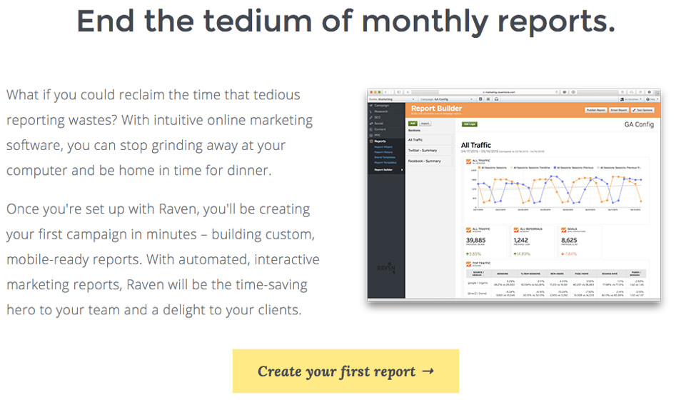
Source: RavenTools
Color and the Brain
Our brains react to colors in different ways. Using the right color will boost your conversion. According to The Impact of Color Marketing, up to 90% of snap judgments about products are made based on color alone.
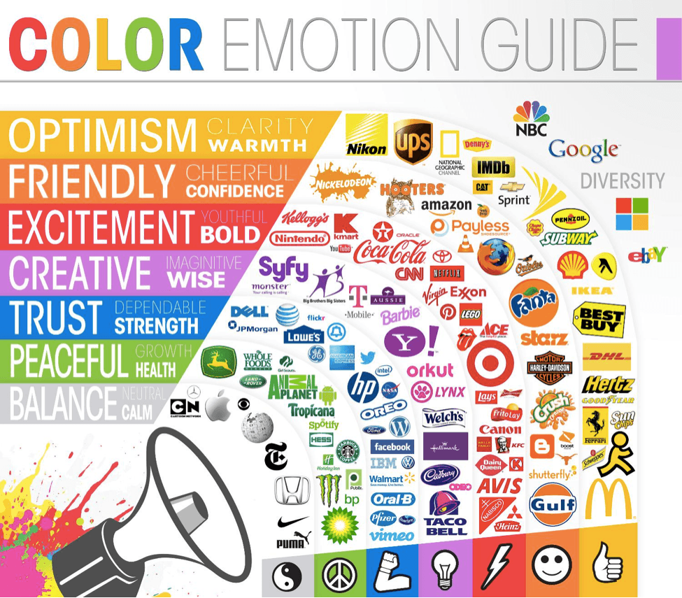
Source: The Logo Company
Below are some vital areas where a change of color could improve your conversion rate.
- Call-to-action colors: Your call to action color may be different on an otherwise monochrome page. The choice of color depends on how your visitors perceive them and what the colors represent. Popular call-to-action colors include green, red, blue and orange, but it’s up to you to test and see what effect it has.
- Link Color: The main thing to consider with links is consistency. There is usually not a need for neon or unique colors for links because our brains have been wired to look for the blue underlined link. Feel free to experiment, but in most cases, stick with the blue.
- Background color: Landing pages should be easy to view, that is why it’s important to keep a solid color in the background. You don’t want advance textures or parallax features interfering with the text. Remember to use a color that contrasts.
If you’re looking for a magic color, you won’t find one here. There is no right answer for color selection. Experiment and track results to see which colors work best for your landing page.
Landing Page Mistakes
Landing pages have evolved to keep up with sophisticated data measuring tools. What once was good practice, simply does not work anymore. Here are a two common landing page pitfalls to avoid.
- The one-size-fits-all template. A landing page needs to be crafted for each service or offer you choose. Test, measure and refine your message, layout and color strategy for optimal results. Aim for giving the user exactly what they are looking for—in as little time as possible.
- The hard offer push. No landing page should feel like a contract. Instead of pressuring your potential clients, ease them into your conversion funnel with valuable content they can use and refer back to.
- Landing page that can be crawled and indexed: If you are making multiple landing pages to test conversion, remember to “noindex” your PPC landing pages to avoid duplicate content penalties from Google. Also, if your landing page includes an event with a specific date and time, you definitely want to “noindex” the pages. You can also remove your landing page from search via the robots.txt file.
Conclusion
Finding the best landing page for conversions will be an ongoing process, with continuous improvements and refinements. With every change you make, be sure to test and measure your results. You will start to see what works, what doesn’t, and how visitor behavior changes over time.
If you always keep the user’s experience at the forefront of your landing page strategy, and you will find success.
Additional Resources
- Our Lead Generating Website Guide details how your firm can generate qualified leads with its website.
- Ensure that your website and content gets found online with Hinge’s SEO Guide for Professional Services.
How Hinge Can Help
Your B2B website should be one of your firm’s greatest assets. Our High Performance Website Program helps firms drive online engagement and leads through valuable content. Hinge can create the right website strategy and design to take your firm to the next level.