Does your firm need a new logo? How do you decide? How often, if ever, should you update it?
To answer these questions, let’s begin by talking about what your logo is to your firm.
If your organization’s name is the primary proxy for your firm in the minds of your audience, your logo stands right there beside it—its visual copilot. It not only is a literal symbol of your business, it plays a critical role in helping people recognize and remember your firm.
If this last statement is true—and science tells us it is—why would you ever change your logo? Wouldn’t that undo years of accumulated recognition? Possibly. But that may not necessarily be a bad thing.
Good Vibrations. Bad Vibrations.
People often make snap judgments about almost everything—including your business—based on the flimsiest of reasons. The science of neuroeconomics explores this phenomenon of human irrational behavior.
The implication here is that your logo can send signals to prospective clients about the sophistication of your firm. If your logo sends negative signals, that’s how some people who have never experienced your firm will perceive you. If it generates positive feelings, however, it can instantly make your firm seem more credible, capable and trustworthy.
Firms grow up. They evolve. They compete at a higher, then higher, level. A logo has to grow up too, or like Peter Pan it will get stuck in the netherworld of a distant time. It will become misunderstood.
How Logos Change
Some logos evolve incrementally, with small updates made over time. Think Coca-Cola. It first introduced its iconic logo script in 1887:

Not much has changed in 138 years!
Other logos change fundamentally. Here was Microsoft’s logo in 1975:
Groovy. Would this logo work today? No way. Not only does it reflect a distant mirror-ball-era design aesthetic, but its thin, closely set lines look abysmal even on today’s high-resolution screens. Of course, Microsoft as a firm also evolved. When it introduced Windows, the company entered a new era requiring a new narrative. Today, their logo continues to tell that story:

Other logo updates lie somewhere in between. When Deloitte & Touche became Deloitte in 1993, they retained, in a subtly altered form, their typeface. The only addition was a green dot at the end, which has become a signature brand element.
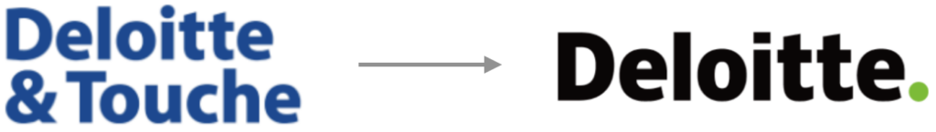
The simplified name, change in color and intriguing declarative period position them as bolder and more self-assured. Even decades later, their logo leads them with confidence into the future.
When Should You Consider a Change?
So what about your firm’s logo? Does it need a makeover? Here are five questions to ask yourself as you assess it:
- Does it differentiate you? Get online, pull up your top competitors. Does your logo set you apart? Or does it and its colors just blend in?
- Is it modern and fresh? Again compare your logo to your competitors. Does yours feel stale or stuck in the Land Before Time?
- Does it convey who you want to become? Think of the competitor you most admire. How is their logo different from yours?
- Does it support your brand? Are you a bold and innovative company? Then your logo should represent those characteristics. What does your brand stand for?
- Is it practical? Is your logo too complicated? Is it hard to read at small sizes? Does it never seem to fit the space allotted to it?
It never hurts to get some outside perspectives, as well. Ask friends and clients what they think. Give them permission to be critical.
You may decide your logo is doing its job. You may decide it could benefit from an update. Or it may be clear that it needs a complete overhaul. But you will have shone light on a part of your brand that may be of greater importance than you thought before.
Now, please don’t take this argument to extremes. We are not suggesting that your logo alone can solve reputational problems or generate more revenue. But it can be part of the solution—along with a host of other factors, from your positioning to the messages you deliver to the design and images on your website.
A successful brand tells a unified story, each piece supporting a central theme. A clumsy or outdated logo can create cognitive dissonance and plant seeds of doubt early in the buyer journey—just when you need to make the best impression.
If you want to give your brand and business every advantage, don’t forget that little jewel in the top left corner of your website—the single piece of your brand that has the greatest chance to be seen and stored away in people’s minds.