A company’s website isn’t just a marketing tool – it’s often a prospect’s very first impression. It communicates your value, highlights your expertise, and can instantly dictate whether a visitor dives deeper into your online ecosystem or immediately clicks away. I’m sure you can remember a time when you landed on a company’s homepage and immediately left because you felt the website was outdated or not user-friendly. You probably don’t even recall which organization it was, simply because its website wasn’t memorable.
Borrowing from the 1999 iconic rom-com “10 Things I Hate About You”, a recent episode (attached below) of Hinge’s Spiraling Up podcast put a marketing twist on this cinematic masterpiece. Our team identified 10 Things We Hate About Websites. This blog will highlight each of these website pitfalls, explain how they negatively affect user experience, and showcase a company that successfully avoids these common mistakes.
We’re not going to pay someone to get you to the end of this blog (like how Patrick was paid to date Kat), but we will reward you for it. If you stick around to the end of the episode (and this article), you’ll find out which of our hosts delivered an emotional rendition of the original poem, “10 Things We Hate About Websites.”
1. Complex Main Navigation
What’s the problem? Overcrowded navigation bars with poorly organized categories quickly overwhelm a visitor and instill decision fatigue. When there are too many choices to click on, the visitor struggles to identify where even to begin. Regardless of a company’s strong industry expertise or excellent thought leadership, if a visitor cannot easily find the information they need, that company immediately loses credibility. Even worse, it might even lead them to abandon their search altogether.
Further, companies should consider that users frequently access their websites on mobile devices, making an already extensive navigation menu appear even more daunting on a small smartphone. The issue of complex navigation bars is standard, with websites suffering from much higher bounce rates as a result.
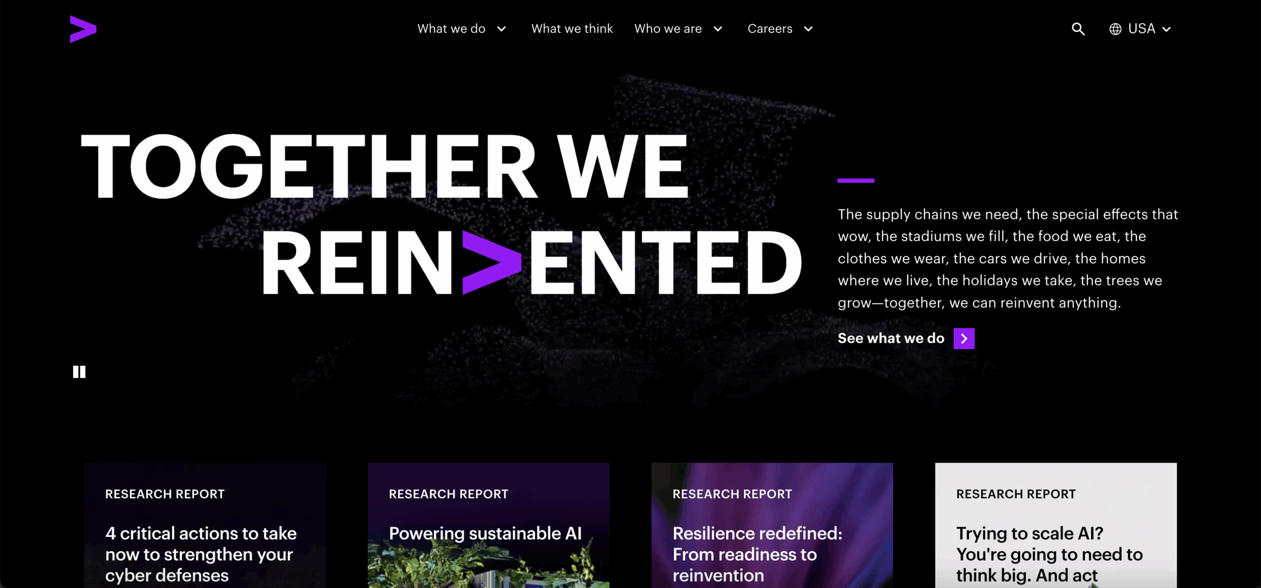
Who’s doing it well? Accenture.
Despite being one of the largest management consulting firms, Accenture’s website excels at being easy to navigate. Their top-level navigation features four options— “what we do,” “what we think,” “who we are,” and “careers”—each with alphabetized subcategories. Accenture’s navigation does an incredible job of being intuitive and taking the user to the information that they seek. The fact that even a huge organization can create navigational simplicity highlights just how crucial this factor is for all companies to achieve.
2. Bad Homepage Headlines
What’s the problem? If an organization’s homepage doesn’t portray who they are and what they do right off the bat, they are losing out on key prospects. Many professional services websites fall into the trap of featuring generic, vague, or overly clever headlines that fail to immediately communicate the organization’s identity, value proposition, or services. With current trends reporting a dip in traffic to other pages like blogs, the homepage is becoming increasingly important to capture the attention of visitors.
Homepage headlines must be clear and instantly communicate the company’s mission. Generic tropes that do not differentiate the company simply will not cut it. Buyers are looking for experts to solve specific challenges, and a bland or overused headline won’t capture their attention and, more importantly, establish trust.
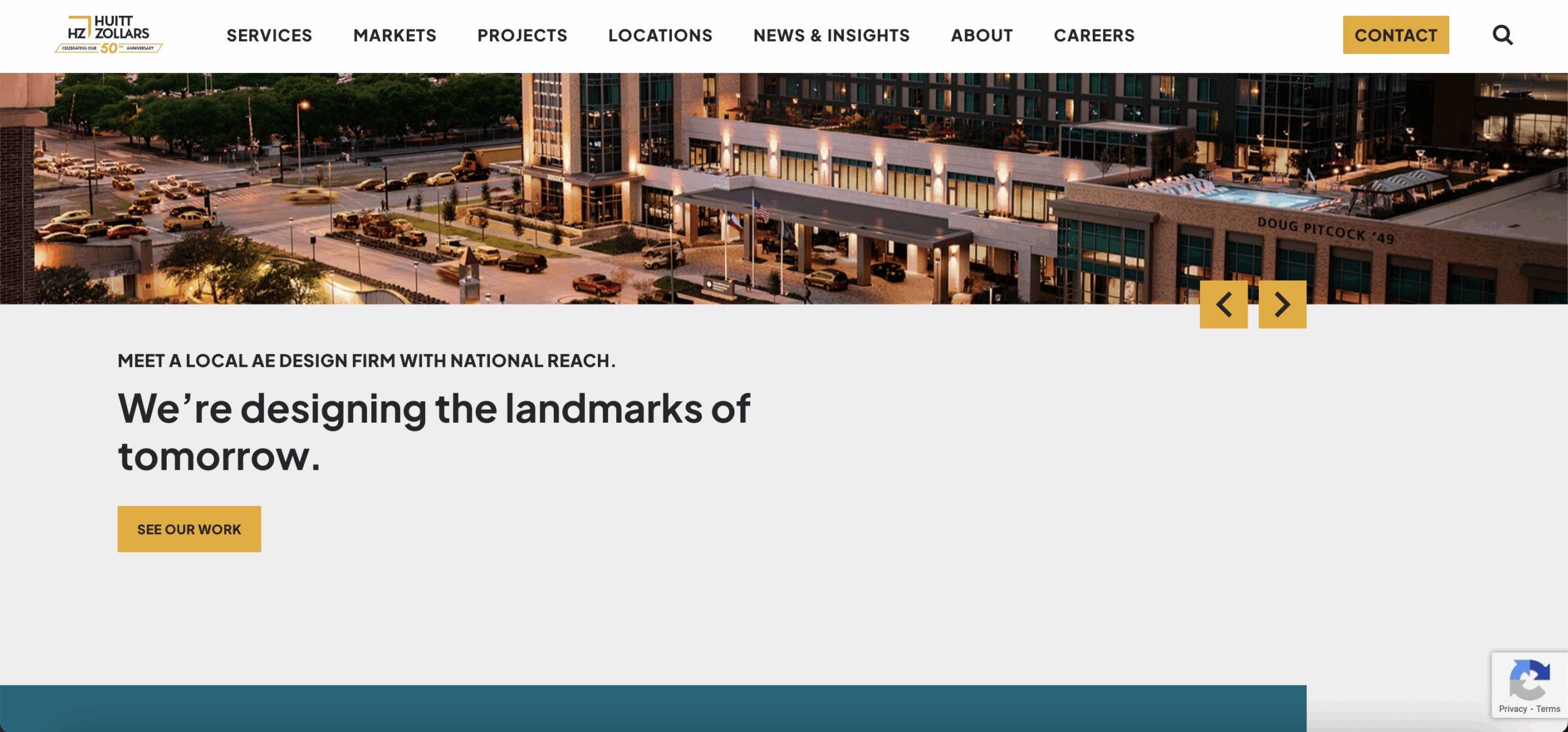
Who’s doing it well? Huitt-Zollars.
Huitt-Zollars uses the headline “We’re designing the landmarks of tomorrow” to convey their mission. While also being memorable, this headline immediately communicates that they’re a design agency, working as engineers and architects to quite literally build structures. The mission statement is well-positioned, and the “see our work” call to action leads visitors to check out their large project portfolio. The combination of clear words and impactful imagery instantly conveys who they are and what they do.
3. Complex Imagery
What’s the problem? Bland and dated visual design, especially without a clear aesthetic that communicates a company’s identity, is a significant drawback. In our experience, we know that most buyers will check out your website before contacting you. Therefore, visual design is a huge part of marketing to potential new clients and attracting top talent. Companies that do not devote time to considering the visual ease of their website suffer huge disadvantages compared to their competitors.
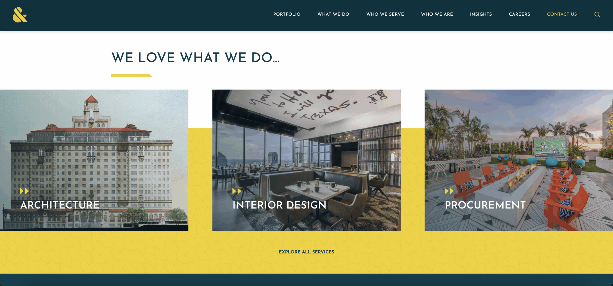
Who’s doing it well? Thiel & Team.
Thiel & Team effectively showcases inspired art direction through a number of channels. One of Hinge’s award-winning clients, their website features a mix of colorful custom and stock imagery, which differentiates them from their grayscale competitors. From the video portfolio at the top to subtle textures behind their logo, their visual brand communicates sophistication, elegance, and originality. Thiel & Team demonstrates how even small businesses can build a top-tier project portfolio to allow their work to shine and create a memorable user experience.
4. Websites With No Filtering Tools
What’s the problem? Many professional services companies fail to build filtering tools into their website, placing the burden on the user to slowly read through content in the hope of finding what they truly seek. This issue is particularly common with older or fast-growing websites that accumulate a large volume of content. Without filtering, website visitors are forced to sift through irrelevant information, which is frustrating for the reader and a wasted opportunity for the company to guide their experience.
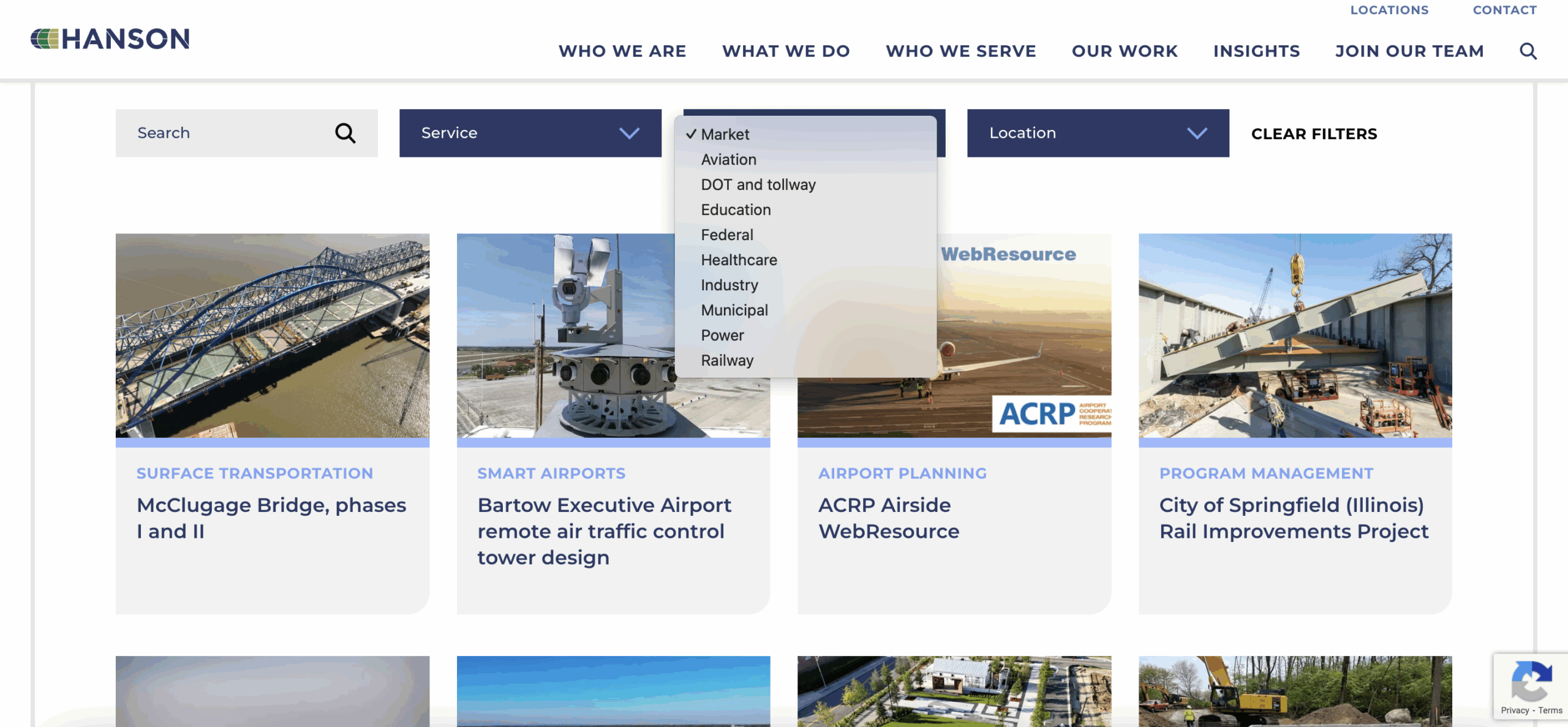
Who’s doing it well? Hanson Professional Services.
Website visitors can filter past projects by “service”, “market”, and “location” to learn about the specific projects that meet their needs. Similarly, the “Insights” section offers a wide variety of filters that provide readers with quick, digestible content about Hanson Professional Services and their work. These tools ensure that users can efficiently locate the information they need.
5. Lack of Case Stories
What’s the problem? Many professional services websites miss the opportunity to showcase success stories, past performance, or case studies. In the professional services space, buyers heavily rely on evidence of past accomplishments. Case stories provide direct insight into the results clients receive. They are a great tool to help prospects evaluate whether they want to invest in a particular organization and which services they are willing to spend money on. Since demonstrating past success is key to establishing credibility, organizations that do not highlight these accomplishments on their website miss a vital connection point.
Even when confidentiality agreements prevent referencing specific organizations, companies can still provide anonymized examples that describe the size and function of the company they supported and, more importantly, describe the solution and results they provided. Although anonymized stories are a solution when organizations find their hands tied, the most impactful examples put a face to the client. If anonymity might be a potential setback down the road, companies should work to spell out their needs before signing new client engagements.
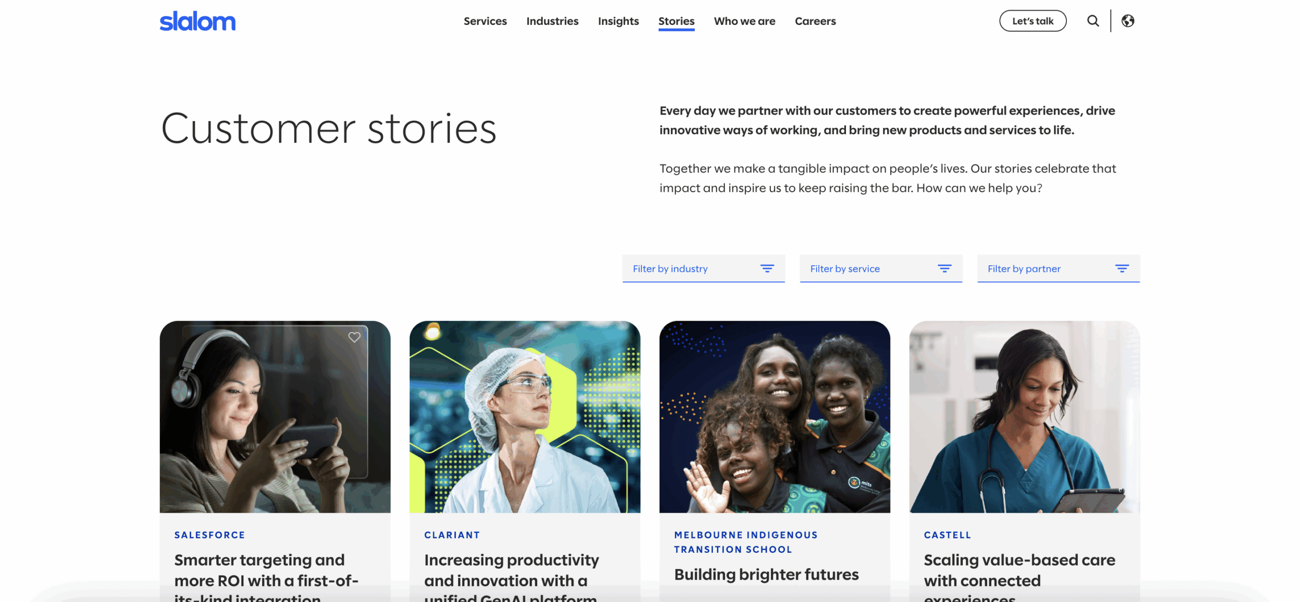
Who’s doing it well? Slalom.
Slalom, a large consulting firm, excels at featuring customer stories on their website. They place “customer stories” directly in their main navigation to immediately highlight their accomplishments. These stories attribute names to clients, ranging from large companies to smaller organizations, demonstrating their broad experience. Slalom heavily invests in making these stories visually interesting, with quick “at-a-glance” summaries that highlight the problems solved and the results achieved. This approach provides the proof of past performance that potential buyers seek on a website.
6. Lack of Expert Bio Pages
What’s the problem? Many professional services websites fail to include expert bio pages that highlight leaders’ individual expertise and industry contributions. When prospective clients visit a website, they want to know who they will be working with and to confirm that the company possesses the necessary expertise for their needs, especially in a relationship-driven industry like professional services. Failing to showcase the people behind the services is a missed opportunity to build a connection.
A common objection to featuring individual experts is the fear of them being poached by headhunters. While this is harmful for many reasons, one being the lack of deserved recognition, research consistently shows that it is more dangerous to omit this information than to include it. The fastest-growing companies invest in highlighting their people’s expertise, which means that the benefits of increased visibility and firm reputation significantly outweigh the perceived headhunter risk.
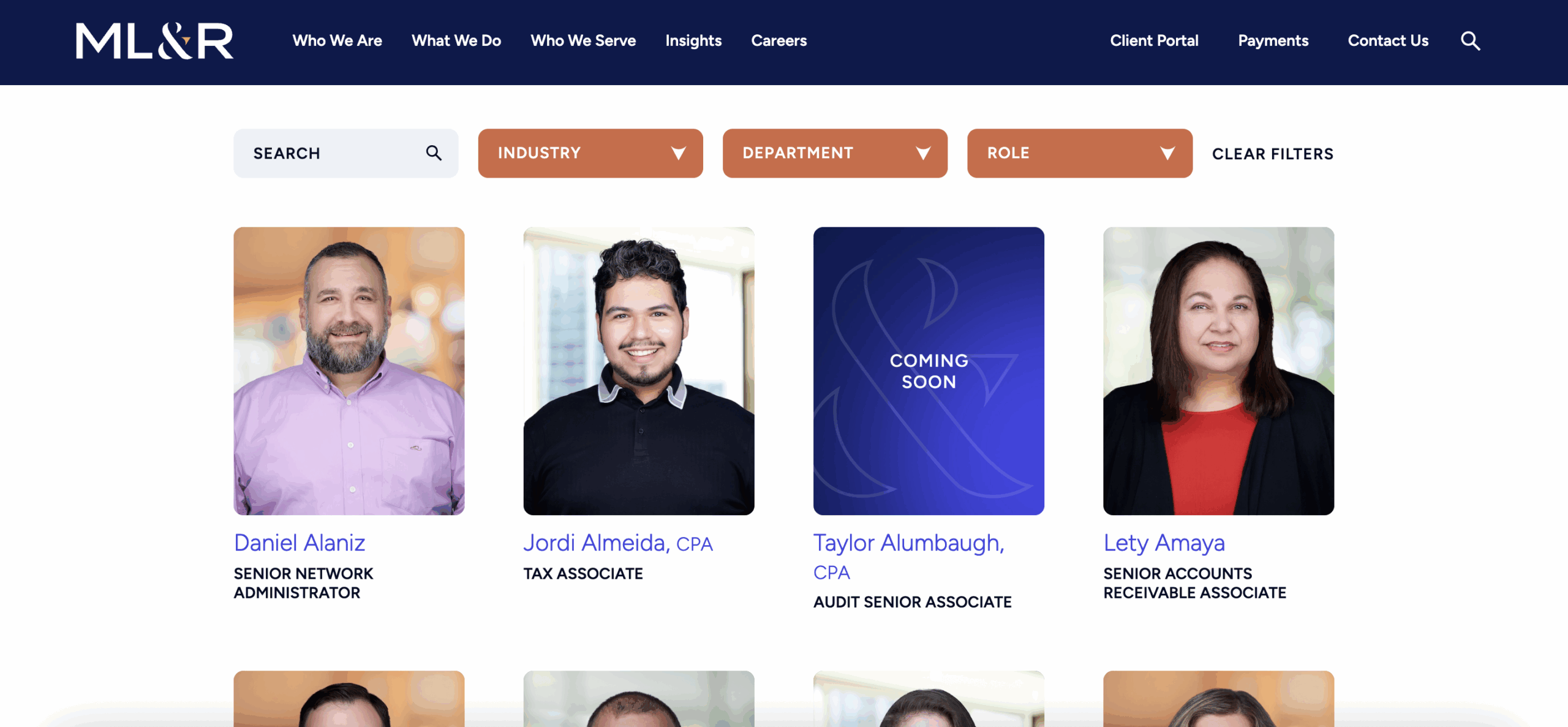
Who’s doing it well? Maxwell Locke & Ritter (ML&R).
Maxwell Locke & Ritter (ML&R), an accounting firm, excels at showcasing their people and culture. Their bio section captures their experts’ unique backgrounds by offering a mix of personal and professional insights. In addition to standard information, such as education and industry experience, they offer a personal touch by including direct quotes or candid pictures. ML&R’s website also provides a transparent user experience by allowing users to filter experts based on “role”, “industry”, and “department”.
7. Attributing Thought Leadership to the Company
What’s the problem? One of the largest challenges that companies face with thought leadership is attributing it to the proper source. Oftentimes, companies replace the actual content author with a generic figure such as “the company”, “staff”, or “the marketing team”. This is a major missed opportunity because thought leadership provides a direct insight into a crucial differentiator for professional services: the people themselves.
When experts are not recognized for their work, they lose the chance to share their role in the organization, discuss their passions, and highlight the types of problems they solve. Not only does this hide the firm’s individual expertise, but it also discourages future thought leadership contributions. Further, attributing content to individuals is crucial to building trust with prospective clients. When a prospect follows a specific expert, they engage with the company and develop confidence in that expert, helping build a rapport with the organization before they even engage.
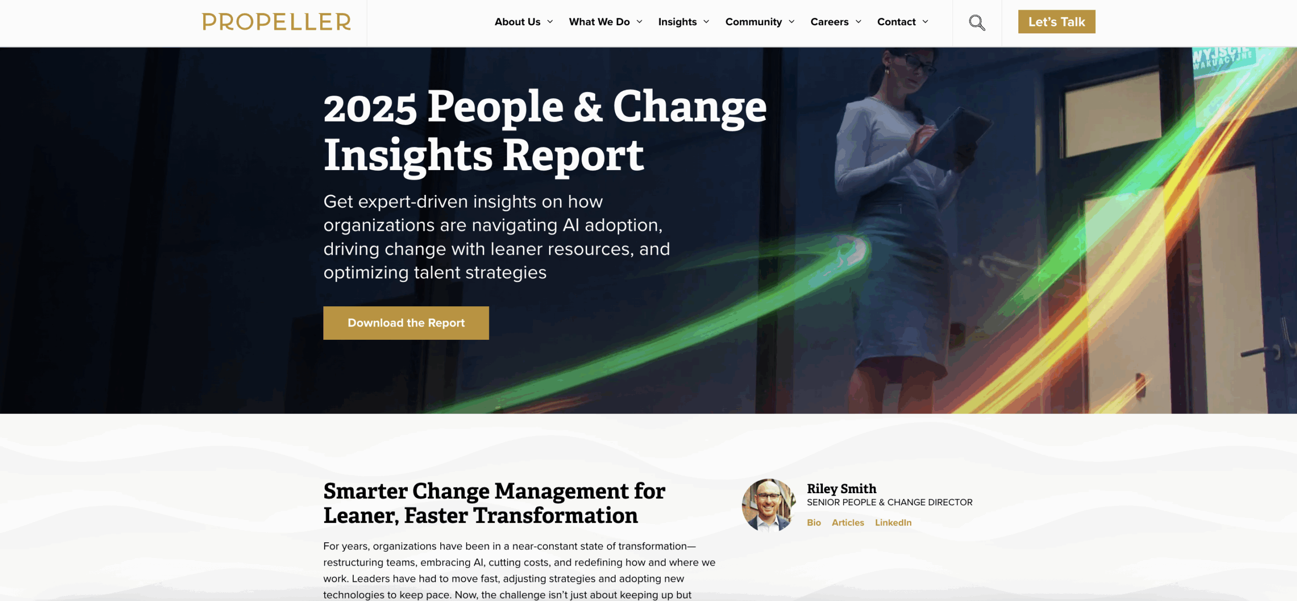
Who’s doing it well? Propeller.
Propeller does a phenomenal job of attributing their thought leadership to specific experts. For instance, one research report prominently lists their Senior People & Change Director at the top of the page. Direct links take readers to his bio, published articles, and even his LinkedIn profile, directly showcasing him as a “Visible Expert®” in their field. Propeller doesn’t hide their experts. Instead, they put them front and center to help paint a picture of their organization.
8. Lack of Video
What’s the problem? A common mistake that professional services websites make is not including video content. Historically, video has been seen as unattainable, timely, and expensive. However, with technology advancements, including AI video creation tools, video content is now attainable and affordable for all companies, regardless of size. Companies should turn toward video to showcase company values, highlight work ethic, and demonstrate the experience clients will receive when signing agreements.
In addition, websites without video miss the opportunity to capture viewers’ attention and provide a visually engaging experience. In the professional services space, building trust is fundamental. Video can show prospects valuable insights while also providing an emotional connection to the brand. It brings projects and concepts to life, which in turn makes the user more immersed and connected.
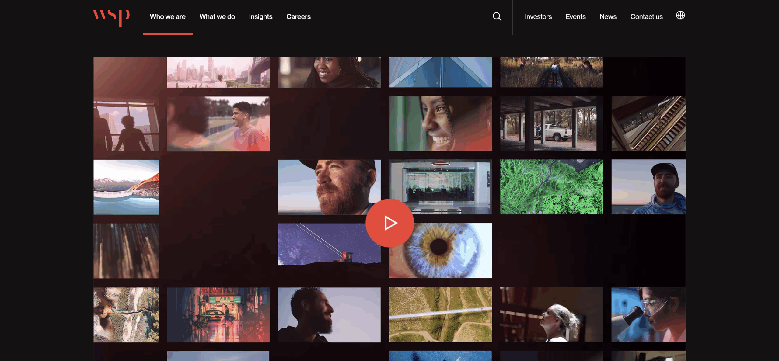
Who’s doing it well? WSP.
WSP’s website is a perfect example of how video enhances user experience. WSP’s “Who we are” section showcases a high-quality video that immediately introduces visitors to their organization. The video combines a variety of visuals with a clear voiceover, which guides viewers through the company’s work. This sophisticated digital element elevates the WSP’s website and positions them as a leader.
9. Lack of Employer Branding
What’s the problem? An uninteresting or underdeveloped careers section is a common shortcoming amongst professional services websites. Oftentimes, companies simply list job openings without providing the additional information that potential recruits care about. Job seekers want to learn more about mentorship opportunities, professional development, and company culture – aspects that cannot be covered in a basic job description.
Failing to articulate these crucial elements on a website creates an incomplete picture of what it’s like to work for the organization. By contrast, a robust career section can personalize the experience for different types of job seekers (experienced professionals, early career, interns, military veterans) and provide answers to common questions about benefits, application processes, interviews, and training. In today’s competitive hiring environment, offering an engaging and informative career section is essential to attract top talent.
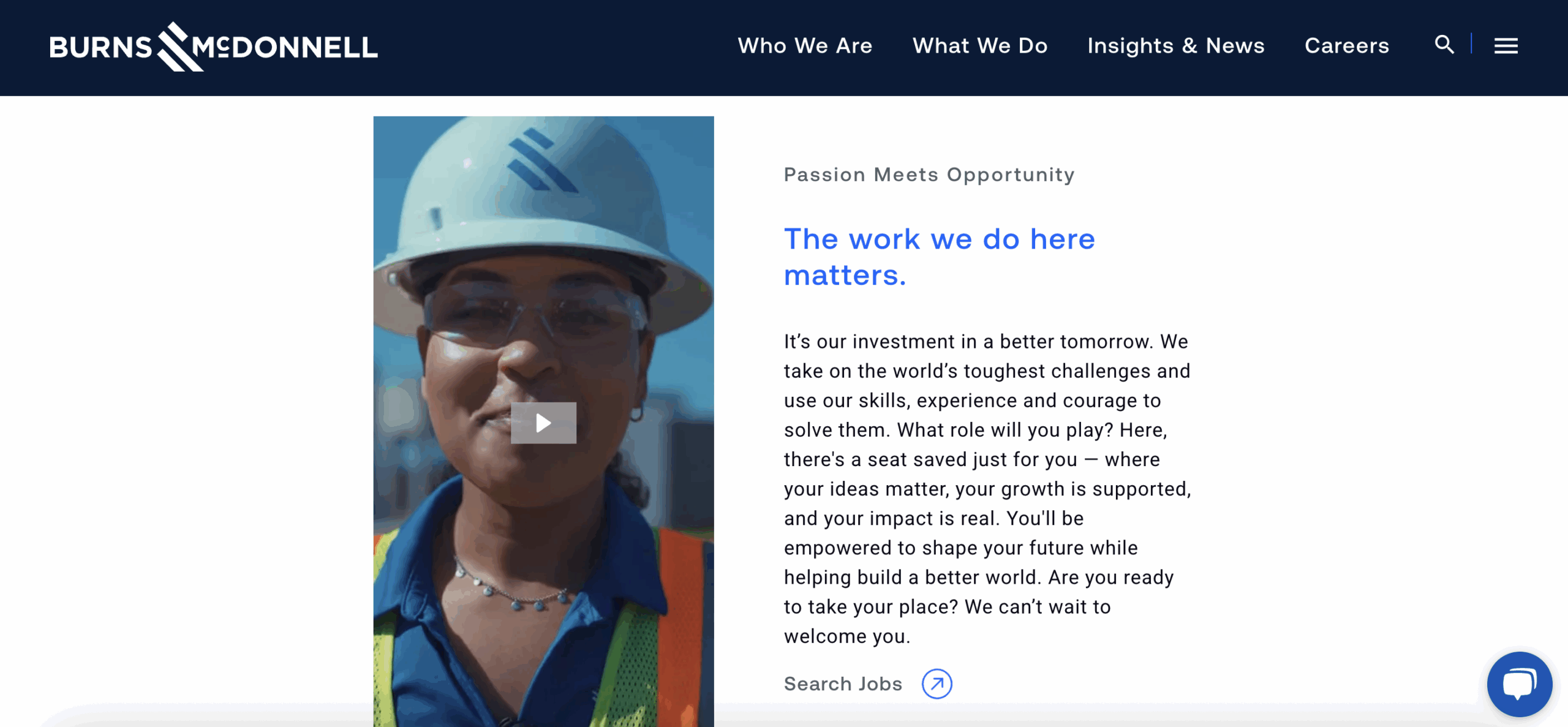
Who’s doing it well? Burns & McDonnell.
Burns & McDonnell, a recipient of Hinge’s Marketing Superlative Awards, excels in employer branding. Their “careers” section goes beyond basic job listings to provide employee success stories and highlight their awards. They use tailored messaging to personalize the experience for their diverse audiences and provide robust resources that answer questions ranging from employee benefits to training and development.
10. Poorly Optimized for Search
What’s the problem? When professional services websites ignore SEO practices, they dramatically limit visibility. While the world of SEO is constantly changing, SEO remains crucial for long-term success. A strong SEO backing ensures that a company’s content is discoverable by search engines and large language models (LLMs), regardless of fluctuations in organic traffic..
Ignoring SEO, or viewing it as too much work or a waste of time, will ultimately handicap the user experience and the visibility of potential buyers. While direct website traffic might see shifts, the goal is to ensure that when people are searching for solutions, whether through traditional search engines or new AI tools like ChatGPT, Google Gemini, or Perplexity, your company’s expertise and offerings are clearly understood and found. A sustained commitment to creating high-quality, keyword-driven content and a perpetual SEO strategy leads to more qualified conversations.
Who’s doing it well? Hinge.
Hinge has consistently invested in its own SEO for years. Despite our size, we have been able to outperform many other marketing agencies and competitors in terms of benchmarks and website traffic. This long-term investment in creating high-quality, keyword-driven content has positioned us as a recognized expert in professional services marketing. Even with current shifts in search engine behavior and declining overall traffic, Hinge is seeing leads originating from new sources, including LLMs. Therefore, a strong SEO foundation is key to positioning a company to be understood by digital platforms and allowing them to capture qualified leads and conversations.

Conclusion
We have all experienced the frustration of a poorly designed website – the confusing navigation, the generic messaging, the endless scrolling to find what you need. In this blog, we’ve laid out the ten most common pitfalls we see on professional services websites and demonstrated that when addressed properly, they are opportunities to stand out from the competition.
Give your audience a headline that’s clear and memorable. Position your experts front and center. Replace long, uninspired text with engaging videos and images. User-friendly, transparent, and informative websites are ultimately the ones that stand out, attract, and resonate with potential clients.
And now, for the moment we have all been waiting for – the poetic finale. Just like Kat’s memorable poem, Hinge’s version puts a passionate, marketing twist on our list of website grievances.